Solved
Adding Data Label in Visualizations
Hi All,
Are there any way to add data values as labels like in excel in Bar graphs.
Refer the image below.
As well increase the numbers of series (refer the screenshot below)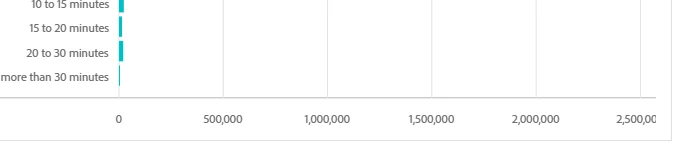
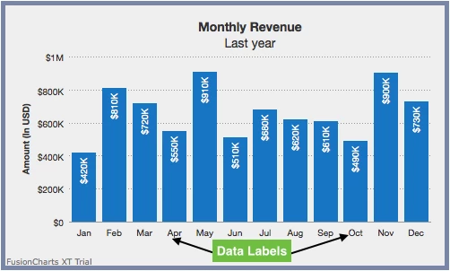
Hi All,
Are there any way to add data values as labels like in excel in Bar graphs.
Refer the image below.
As well increase the numbers of series (refer the screenshot below)
Combo visualizations will also give more insights, but it is a comparison viz.
Enter your E-mail address. We'll send you an e-mail with instructions to reset your password.