Level 3
February 28, 2017
Delivered

Analysis Workspace: Compact Report Stylesheet

  • February 28, 2017
  • 15 replies
  • 23101 views

It would be great to have a compact stylesheet for Analysis workspace. The current layout has a lot of empty space which can be great at times, however, having a compact view will be very beneficial for:

  • Layout configuration - saving space
  • Less scrolling with more data on screen

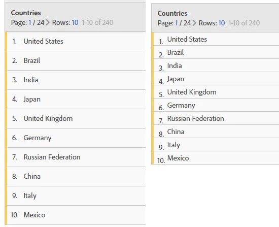
In the old reports you were able to have maybe 3 tables within single screen vertically, wiht the new layout in AW you can hardly fit 1. Image below illustrates that even just removing the padding makes the table much more compact and shrinks it by 25% I am sure it can be done further.
15 replies

Employee
September 25, 2018

Thanks all for the feedback! This is something I'm moving to under review, we are renewing the discussions on this.

Andrew_Wathen_
New Participant
September 25, 2018

Firstly I'd like to say I'm a big advocate of Workspace.  However, in order to be able to able to practically work with Workspace we've had to invest in new large monitors (24"/27") for my team.

I strongly believe this layout issue is one of the reasons that power users in other parts of our organisation are so wedded to Ad Hoc.

It surely can't be good idea to build an interface that requires organisations to invest in new displays or makes it impractical to work with on a laptop screen.

jen.lasser I really hope Adobe act on this idea - Particularly given the decision to finally retire Ad Hoc.

Level 4
March 6, 2017

I know there have been requests to change colors and such, it seems like there could be an opportunity to link these together.

benjamingaines2
Employee
March 1, 2017

Wow, nine votes since yesterday? That's worth noticing, @ProletM. We're discussing this one internally.

Level 2
March 1, 2017

Great idea! The scrolling gets tedious and this seems like a simple fix.