Solved
Graphics Edition
Hi everyone, someone knows how could I include in an Adobe Analytics chart a vertical straight line to make a period separation? For product evolution, visually it would be really helpfull if i could add it. Thanks.
Hi everyone, someone knows how could I include in an Adobe Analytics chart a vertical straight line to make a period separation? For product evolution, visually it would be really helpfull if i could add it. Thanks.
I agree, the current Date Annotations aren't all that visual... I don't generally use Adobe's solution....
Here is a bit of a hacky solution that I use:
1. I create a Custom Date Range... if it's the start of a period, I use a fixed day at the start and a rolling date of today (or change to a fixed day when I know the period will end), and if it's the end of a period, I can set the range as all fixed, or rolling start and fixed end.
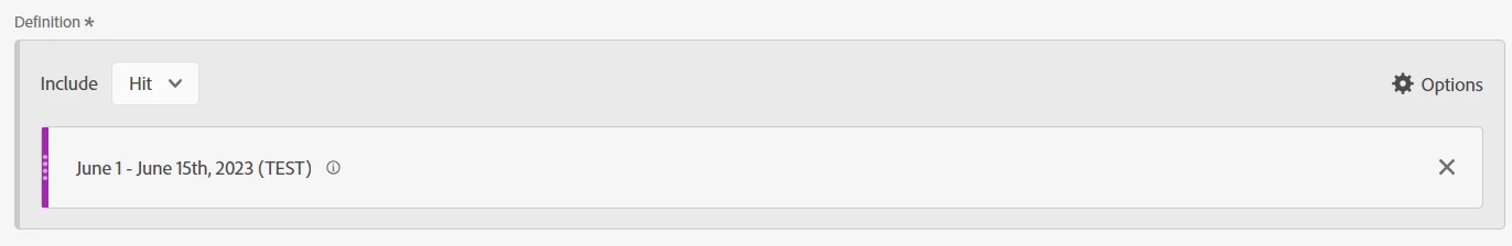
2. Now I create a segment which is basically just "Hit" level, and my date range.. nothing else:
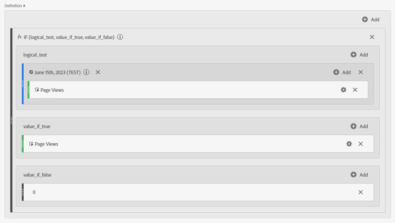
3. Next, create a calculated metric using the IF function (change the metric from Page Views to the metric you need).
Basically, if there is data during the date range, then use the value of the metric, otherwise, use a static number of 0
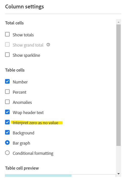
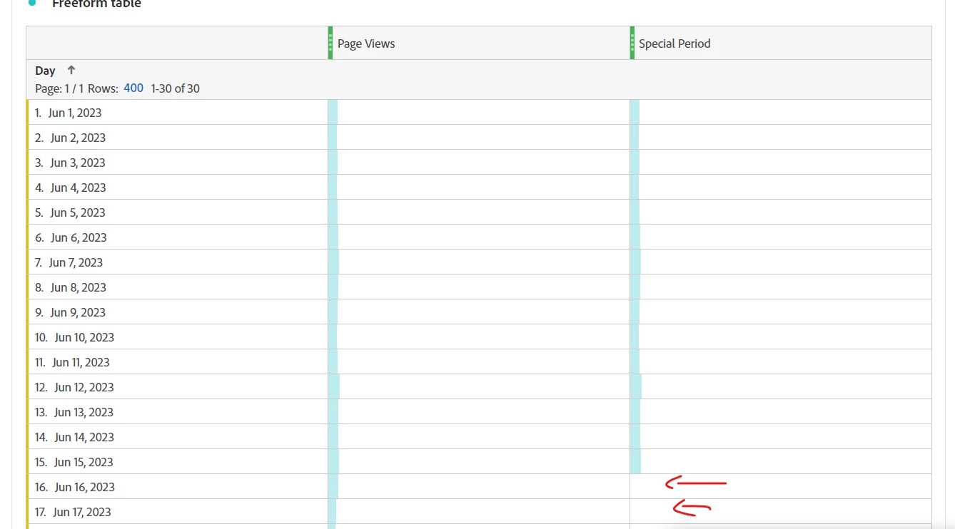
4. In my freeform, I use the metric I am building a report for side by side with my calculated metric, I also make sure that the calculated metric is set to "Interpret zero as no value"
5. Then I graph the two columns as an Area Chart:
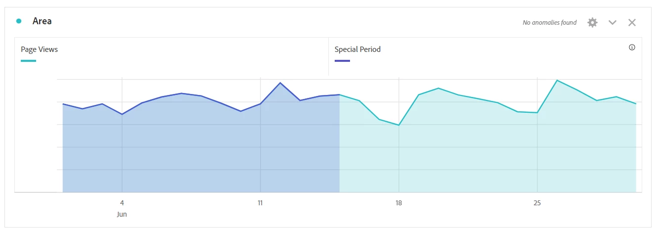
Now I have a nice vertical division visual in my chart.
Enter your E-mail address. We'll send you an e-mail with instructions to reset your password.