Cards titles look different when published | Community
Skip to main content
New Participant
March 24, 2016
Solved

Cards titles look different when published

  • March 24, 2016
  • 18 replies
  • 7848 views

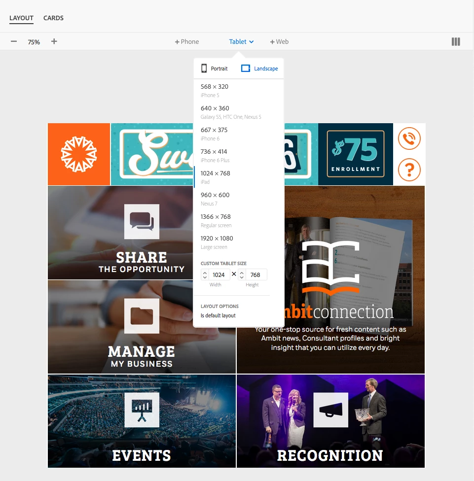
Here is what is happening. I have created my layout and cards using custom fonts. The problem is I get them to look the way I want them in the layout template, but when I publish the App for test viewing the leading is different on the iPad. And even more the Android looks different than both the iPad and Layout Template. Here are some screen grabs to explain:

Here is what they look like in the layout template.

And here is what the iPad ends up looking like. Just to be clear. The icons and "ambitconnection" are built into the card image.

It seems like since my layout template is set to iPad that it should look exactly like that when I publish to the iPad. Any thoughts on why this is happening?

This post is no longer active and is closed to new replies. Need help? Start a new post to ask your question.
Best answer by andreig1004688

Hi, ambitappa77373764‌, Keith,

As Nathan pointed out, there are a few OS - differences that lead to differences in how text is rendered. This is especially true for leading values smaller than 1.1.

The only current work-around is to use leading values of 1.1 or larger and adjust your font metrics in a glyph editor to create the tighter leading for you fonts. 

Andrei

18 replies

New Participant
August 18, 2016

Hi I'm having the exact same issue. So nearly4 months later we are still facing the prob.

My template Layout does not look similar on my Ipad devices especially on the fonts. SO I'm kind of blind when I do my design on AEM.

Help would be appreciated

andreig1004688
Employee
April 1, 2016

ambitappa77373764, I'd be happy to connect.

Do send me a line at ganci@adobe.com and we'll see what we can do.

Thanks,

Andrei

andreig1004688
andreig1004688Accepted solution
Employee
April 1, 2016

Hi, ambitappa77373764‌, Keith,

As Nathan pointed out, there are a few OS - differences that lead to differences in how text is rendered. This is especially true for leading values smaller than 1.1.

The only current work-around is to use leading values of 1.1 or larger and adjust your font metrics in a glyph editor to create the tighter leading for you fonts. 

Andrei

Employee
March 31, 2016

I passed this on to some colleagues to take a look. They may reach out to dive deeper. There may be some OS-level differences in text compositions, or possible a bug.

New Participant
March 31, 2016

Thanks Keith. That at least tells me it is possible. For a reason we can't figure out we can't get a consistent look across all platforms no matter what we do with leading, padding, margins. It's really not even close. But now I've at least got confirmation it's not acting the way it's supposed to. Is there a place where I can walk through the problem with someone at Adobe?

Keith_Gilbert
New Participant
March 31, 2016

For us, the text display matches across iOS, Android, and the layout template with multiple text fields as long as we use a leading value of 1.1 or larger for each text field.

New Participant
March 31, 2016

‌thanks for the response. Did you end up getting any answers? We've tried every leading value and still are having trouble with it matching across iOS, android and layout template. It becomes worse when adding more than one text field.

Keith_Gilbert
New Participant
March 30, 2016

Funny, we've been struggling this week with exactly the same issue. I've identified a repeatable bug:

If you use a leading value of 1.0 or less for the text on a card, the text will display as expected on Android devices and in the Layout Template view. But the leading appears really large on iOS devices. If you use a leading value of 1.1 or larger, then the text display matches across iOS, Android, and the Layout Template.

We encountered this bug because, like you, we have large icons with small type below them, so we were messing with leading values less than 1.0 to try to get the lines of type close together.

New Participant
March 28, 2016

‌I guess it's reassuring that someone else has had this same problem but surely this is not what Adobe intended. I'm guessing that most users are not having to look at the live app to see their changes. It just seems like you could skip the layout templates if this was the case. I feel like it must be on my end somewhere. I've just done everything I can think of, and it's still not working.

Gronckle
New Participant
March 25, 2016

I had a similar problem - At least on mine, the layout template is basically an approximation of the final product. The fonts on the layout preview display about 30% smaller than the app and the margins / paddings are nowhere close to the final app's display. I just kept using the live App to judge my adjustments - not worrying about the details on the layout template. After much adjusting, my layout preview looks terrible, but my live app looks just how I wanted. *shrugs*