Solved
How design aem template for below page requirement
Hi All,
How I can design editable template for below page look and feel. Also attached the images.
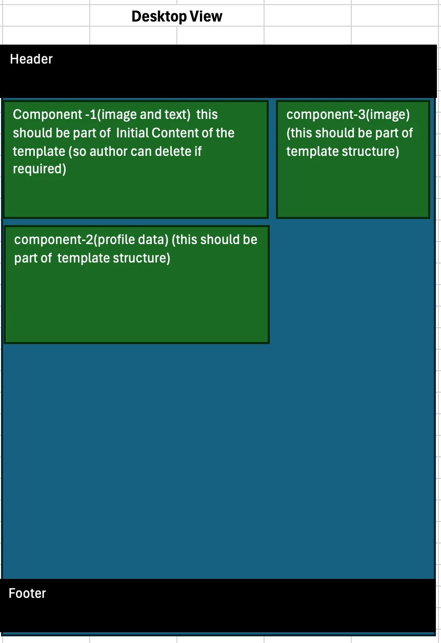
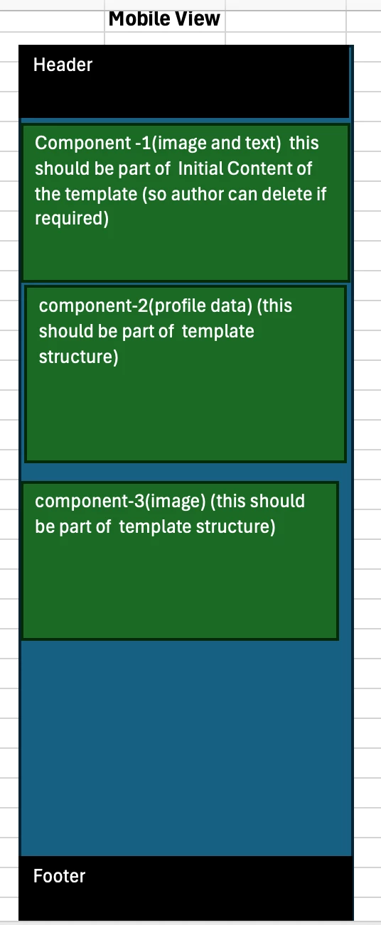
Hi All,
How I can design editable template for below page look and feel. Also attached the images.
Hi @amitsi18 ,
Thanks for reaching out. Based on the above requirements , there are multiple ways to achieve this below is one of the option
Thanks,
Anil
Enter your E-mail address. We'll send you an e-mail with instructions to reset your password.