Layout mode and responsive grid setting | Community
Skip to main content
New Participant
August 29, 2017
Solved

Layout mode and responsive grid setting

  • August 29, 2017
  • 11 replies
  • 10002 views

Hello AEM community!

I have a problem setting up the responsive grid in my AEM app.
I followed the Adobe's tutorial site ( Configuring Layout Container and Layouting Mode - docs.adobe.com ) and I am using 6.1 AEM.

After setting up the node as directed in the tutorial, I could not turn on Layout mode to show the ruler and grids.

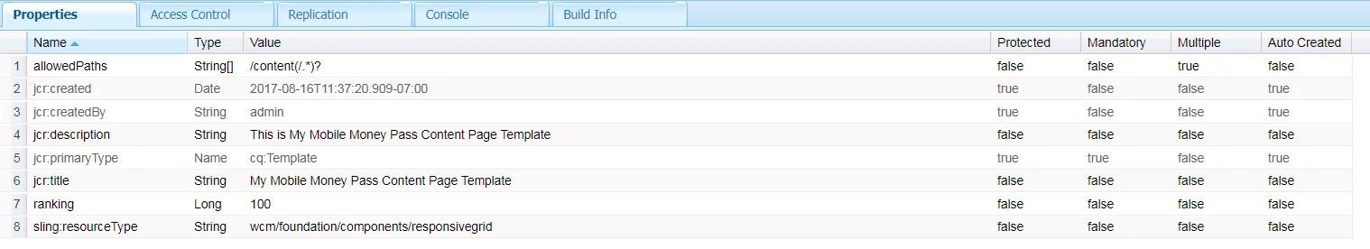
Following are my set ups.

In my template node, we have following properties.

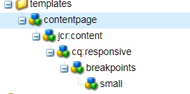
The template node has following nodes.

I have only one break point as shown, however, even I made multiple break points, it does not show layout mode at editor.html

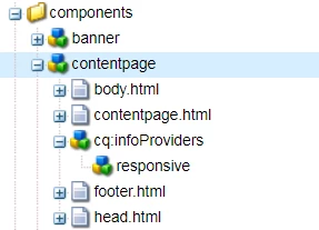
In the Components node, I have the following structure.

The contentpage components is my page component that uses template shown above.

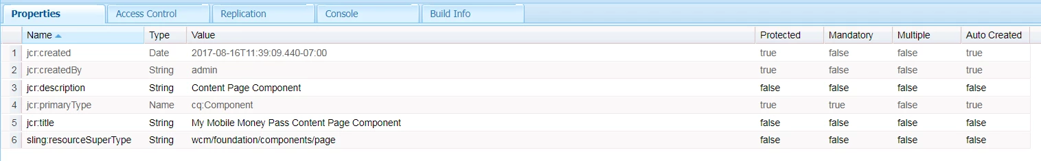
In the contentpage node, I have the following properties

AS you can see from the contentpage structure, I have cq:infoProviders which has a responsive node.

For cq:inforProviders node, I have the following property

For responsive node, I have the following properties

As the tutorial mentioned, I use responsivegrid instead of parsys to make a component drop section

Let's say I have a textField component to use in the page.

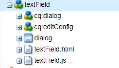
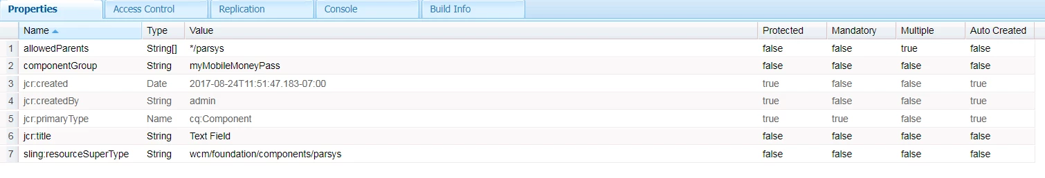
The textField's properties are following

And textField.html is following

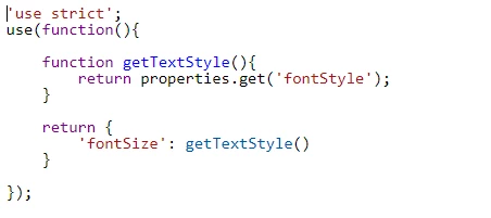
In the text.js I have

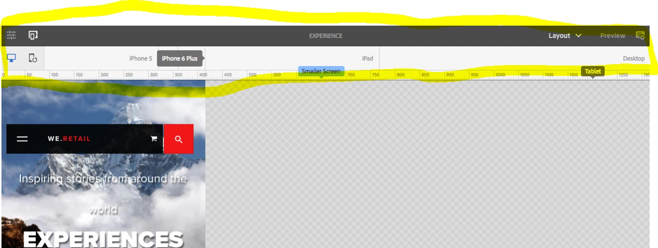
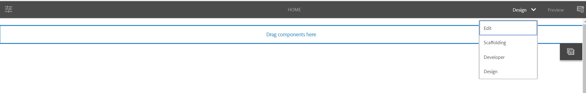
I want to have my editor.html like tutorial. I need the yellowed area.

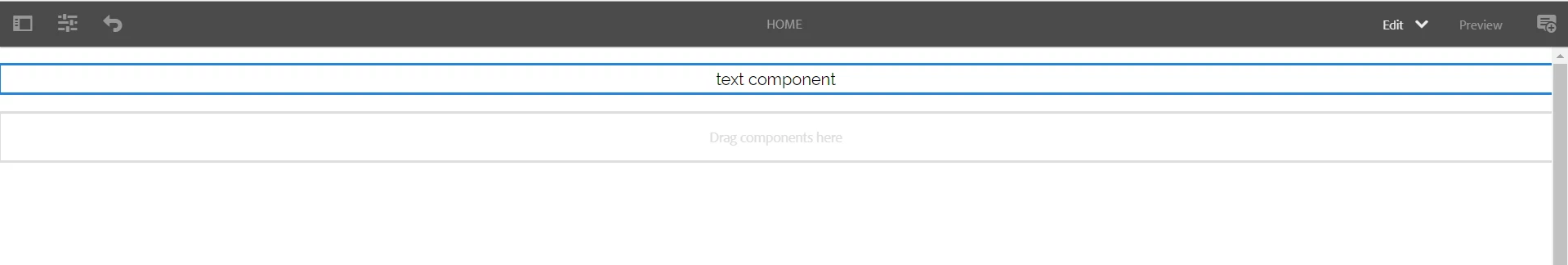
However, my editor.html has Edit, Scaffold, Developer, and Design mode. Not included the Layout mode.

I also want to my editor.html to have responsive component.

However, I have only fixed width component

I think I missed some configuration or did wrong way to set up node.

If you know about layout mode setting, please help me out here

Thank you for your help in advance

Ryu

This post is no longer active and is closed to new replies. Need help? Start a new post to ask your question.
Best answer by Anurag_Kumar

For Showing the rulers (Emulators)

1. Delete sling:resourceType property from your template (/apps/<project-name>/templates/contentpage)

2. Add one more property to your page (/content/<project-name>/mypage)

Property Name= cq:deviceGroups

Type= String[]

Value= /etc/mobile/groups/responsive

This should show the Emulators.

Coming to the actual magic of responsiveness.

1. After emulators are enabled, go to a mobile emulator and shorten the width to say 10 columns. On desktop keep some other width, say 5 columns.

2. Go to CRXDE Lite and check inside /content/<project-name>/mypage/jcr:content/<par-name>/<component-name>. You will see a node named cq:responsive. This will be containing two children "default" and "small" with width property of 5 and 10 respectively.

Actual change in width will happen when you include the grid definition styles.The base grid definition can be found under:

/etc/clientlibs/wcm/foundation/grid/grid_base.less

Please refer:

https://docs.adobe.com/docs/en/aem/6-1/administer/operations/page-authoring/configuring-responsive-layouting.html#Include the Responsive CSS

Thanks,

Anurag

11 replies

smacdonald2008
New Participant
August 29, 2017

In 6.1 - i am checking to see if i have same as you.

I know in 6.3 - there has been major improvements for Layout - as discussed in this article:

Creating an Adobe Experience Manager project using Lazybones

I will post back my findings.