Hey Jen, thanks for thinking about me for this one.
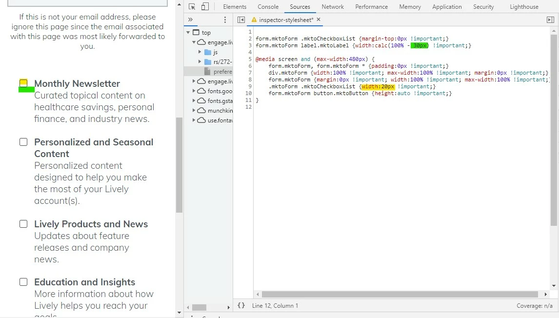
I think the issue you're running into here is that you've got the labels styled to be 90% of the width and when you get down to mobile that ends up being too wide for the 20px checkboxes to display on the same line. Rather than setting the width of the labels to 90%, you can set them to "100% minus the width of the checkbox plus some padding between them" using the "calc()" css property. I've attached some code below that I used in the inspector to work this out on mobile. The top two styles just align the checkbox to the top of the field (in line w/ the labels) and the 2nd line is the calc() css that resizes the labels to account for the checkbox width (20px) plus a little gap (10px).
Under that are styles in a media query aimed at anything less than 480px. This CSS should go at the end of your stylesheet or at the end of the Custom CSS on the form if that's where you're styling it. The idea is we want these styles to override anything else on the stylesheet when you're looking at a mobile device.
Try adding in this CSS:
form.mktoForm .mktoCheckboxList {margin-top:0px !important;}
form.mktoForm label.mktoLabel {width:calc(100% - 30px) !important;}

@media screen and (max-width:480px) {
    form.mktoForm, form.mktoForm * {padding:0px !important;}
    div.mktoForm {width:100% !important; max-width:100% !important; margin:0px !important;}
    form.mktoForm {margin:0px !important; width:100% !important; max-width:100% !important;}
    .mktoForm .mktoCheckboxList {width:20px !important;}
    form.mktoForm button.mktoButton {height:auto !important;}
}
... and see if you end up getting something more like this...
... or let me know if you've got any questions or it doesn't come out that way on your end.