Custom CSS forms - aligning check box and label, reduce space between fields for mobile device - screen size 480px wide or less
Hi there
I’m using custom CSS on a form, two questions:
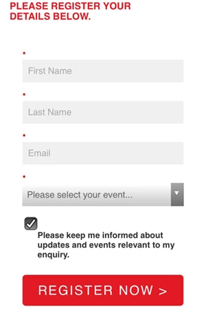
1. The check box and the text are not aligning for a mobile device that is 480px wide or less.
Please advise what to change in the CSS?
2. Would like to reduce the space between fields for a mobile device that is 480px wide or less. For example would like to reduce the white space between the fields 'First Name' and 'Last Name' and 'Email' and 'Please select your event...'
Please advise what to change in the CSS?
@Sanford Whiteman – are you able to assist?
If you would like to look at the live page please follow me and I will send the link privately.
Really appreciate this, many thanks
++++++++++++++++++++++++++++++++++++++++++++++
.mktoForm {
width: 100% !important;
}
.mktoForm .mktoOffset {
float: left;
height: 1.2em;
}
- mkto.FormRow {
float: left !important;
}
.mktoCheckboxList .mktoField[id^="mktoCheckbox"] {
align: left !important;
float: left !important;
clear: both;
margin-left: 0 !important;
}
.mktoForm div,
.mktoForm span,
.mktoForm p {
width: 100%;
}
.mktoForm input[type=text],
.mktoForm input[type=url],
.mktoForm input[type=tel],
.mktoForm input[type=email],
.mktoForm input[type=number],
.mktoForm input[type=date],
.mktoForm select.mktoField,
.mktoForm textarea.mktoField{
width:100% !important;
padding: 8.5px !important;
background-color: #f0f0f0 !important;
font-size: 13px;
color: #666666;
border: none;
box-shadow: none;
}
.mktoForm input[type=radio] {
margin-left: 0 !important;
}
.mktoForm input[type=checkbox] {
float: none;
clear: both;
margin-left: 0 !important;
}
.mktoForm .mktoCheckboxList {
float: left !important;
clear: both;
margin-left: 0 !important;
}
.mktoForm button.mktoButton {
background: linear-gradient(to bottom, #E21A23 0%,#E21A23 100%) !important;
border: 1px solid #E21A23 !important;
border: none;
class: btn btn-primary ${buttonStyle};
class:"btn btn-primary ${buttonStyle}";
font-family:'Helvetica Neue Roman' Helvetica, Arial, sans-serif !important;
padding: 10px 20px;
border-radius: 5px;
text-transform: uppercase;
font-size: 15px;
letter-spacing: 2px;
color: #fff;
}
@media only screen and (max-width: 480px) {
.mktoForm button.mktoButton {
margin-top: 1.5em !important;
}
@media only screen and (max-width: 480px) {
.mktoForm label {
align: left !important;
}
@media only screen and (max-width: 480px) {
.mktoCheckboxList .mktoField[id^="mktoCheckbox"] {
align: left !important;
float: left !important;
clear: both;
margin-left: 0 !important;
height: 20px !important;
}
@media only screen and (max-width: 480px) {
.mktoForm .mktoCheckboxList {
align: left !important;
float: none;
clear: both;
margin-left: 0 !important;
}
.mktoRadioList .mktoField {
margin-bottom: 0.5em !important;
}
.mktoRadioList label {
margin-bottom: 0.5em !important;
}
++++++++++++++++++++++++++++++++++++++++++++++