Question
Dashboard Delivered Pie Chart
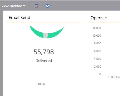
Has anyone seen this in their dashboard view before? It's like a crescent moon phase! (lol) What does it mean? And how can it show as 103% delivered?
 In case this helps, the smart list is comprised of marketable contacts in the US among a set of job roles (custom object) who did not fill out the form in the first email. It's an advanced filter: 1 and (2 or 3) and 4 and (5 or 6).
- 1 = Marketable
- 2 or 3 = US
- 4 = job roles
- 5 = did not fill out the form
- 6 = is not in the list of people who converted