Solved
Exhausted Content Dashboard
Hello, I was wondering what this dashboard graph shows (what the x-axis and y-axis mean). Thank you!
Hello, I was wondering what this dashboard graph shows (what the x-axis and y-axis mean). Thank you!
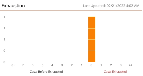
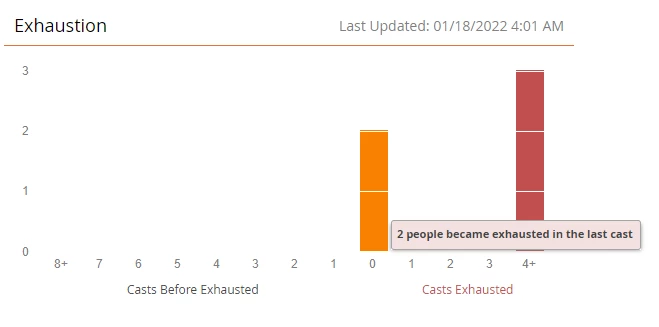
This chart helps you anticipate when leads will have/have had exhausted all the nurture content. The graph is set immediately after each cast. The example below shows that in last cast, 2 leads have exhausted all content.
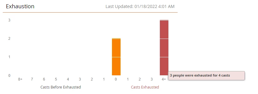
The example below shows that 3 people have exhausted nurture content for the last 4 casts, i.e., these people are not receiving any content for the past 4 nurture casts.
Similarly, the bars on the left of "0" on the x axis shows the # of people that'll have their nurture content exhausted in next 1, 2, 3, … casts. People who are “exhausted” will not receive any nurture content in the next cast. Hope this helps to clear away some clouds for you around this widget.
Enter your E-mail address. We'll send you an e-mail with instructions to reset your password.