Fields in Form Rendering Different Sizes | Community
Skip to main content
keithnyberg
New Participant
December 19, 2017
Solved

Fields in Form Rendering Different Sizes

  • December 19, 2017
  • 1 reply
  • 3178 views

Hey Community,

Trying to understand why my industry field renders as seen below as opposed to using the fixed field widths that I have set in the form. What can be done to keep them all consistent?

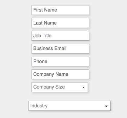
My assumption is that the industry field is larger because of the preset values in the select drop-down.

Can anyone confirm this? Also, what are people doing (if anything) to correct this rendering issue. Issue only occurs when the page is scaled smaller than normal screen size.

Can CSS formatting fix this? Any thoughts would be appreciated.

Sincerely,

Keith Nyberg

This post is no longer active and is closed to new replies. Need help? Start a new post to ask your question.
Best answer by SanfordWhiteman

It's actually not just the length of the <option>s. It's that in conjunction with this custom style in your style-2017.css:

@media screen and (max-width: 1255px) {

    .mktoForm input[type=text],.mktoForm input[type=url],.mktoForm input[type=email],.mktoForm input[type=tel],.mktoForm input[type=number],.mktoForm input[type=date],.mktoForm select.mktoField,.mktoForm textarea.mktoField {

        width: 100% !important

    }

}

So you'll need to make your responsive styles more integrated with the default width calculations for complex elements like this. Also, width: 100% is almost always going to lead to problems if you have other responsive styles applying to parent elements (because width:100% doesn't really mean "full" width, it's the calculated width of parent elements which can include margin/padding).

1 reply

SanfordWhiteman
New Participant
December 19, 2017

Most likely because of the length of the longest value, yes. HTML <SELECT> els always do this. If you post a link to your page I can confirm.

keithnyberg
New Participant
December 19, 2017

Sanford to the rescue! I actually almost tagged you in this because I knew you;d know the answer. Trust your assumption but appreciate the confirmation.

Watch a Sugar Demo | SugarCRM

Any ideas on how to remedy other than shortening the values in the select field?

SanfordWhiteman
SanfordWhitemanAccepted solution
New Participant
December 19, 2017

It's actually not just the length of the <option>s. It's that in conjunction with this custom style in your style-2017.css:

@media screen and (max-width: 1255px) {

    .mktoForm input[type=text],.mktoForm input[type=url],.mktoForm input[type=email],.mktoForm input[type=tel],.mktoForm input[type=number],.mktoForm input[type=date],.mktoForm select.mktoField,.mktoForm textarea.mktoField {

        width: 100% !important

    }

}

So you'll need to make your responsive styles more integrated with the default width calculations for complex elements like this. Also, width: 100% is almost always going to lead to problems if you have other responsive styles applying to parent elements (because width:100% doesn't really mean "full" width, it's the calculated width of parent elements which can include margin/padding).