Form in Mobile View - CSS for padding and font issues | Community
Skip to main content
New Participant
October 20, 2022
Solved

Form in Mobile View - CSS for padding and font issues

  • October 20, 2022
  • 1 reply
  • 2807 views

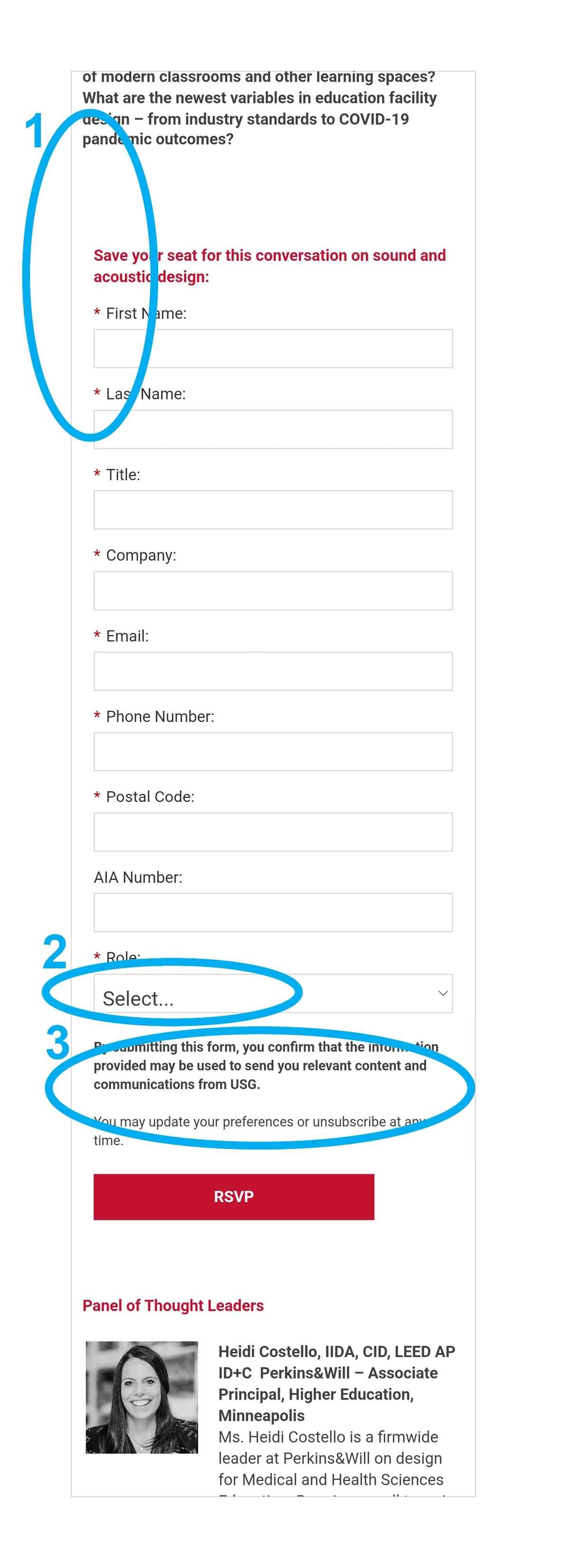
I have three issues I can’t figure out how to solve when the landing page and form is in mobile view. I’m hoping these can be resolved by editing some custom CSS in the Form Theme as I am using the drag and drop Landing Page editor and am not sure how to get to the code there. (What little I've done to the form is probably not totally correct as this is the first time I'm attempting some customization.)


info.usg.com/newyork-acoustics.html


On mobile:


  1. The left and right padding of the form is larger than the padding of the body the form, so the form looks indented.
  2. The “Select…” in the dropdown font gets much larger than all the other fonts
  3. I don’t have an image of this, but it has been reported by others that only the font between the form and the submit button is showing much larger on iPhones. This does not happen with the message at the top of the form.


Appreciate any assistance!

This post is no longer active and is closed to new replies. Need help? Start a new post to ask your question.
Best answer by Disha_Goyal6

Hi @katp_marketing_automation,


Please add the below CSS

@media screen and (max-device-width: 480px){ body{ -webkit-text-size-adjust: none; } }


Thanks,

Disha

1 reply

Disha_Goyal6
New Participant
October 21, 2022

Hi @katp_marketing_automation,


I have checked your page and found all the issues. Please add the below CSS to fix the same


.mktoForm input[type="text"], .mktoForm input[type="url"], .mktoForm input[type="email"], .mktoForm input[type="tel"], .mktoForm input[type="number"], .mktoForm input[type="date"], .mktoForm textarea.mktoField, .mktoForm select.mktoField{ font-size:14px !important; } .mktoForm { padding: 0px !important; } .mktoForm strong, .mktoForm span{ padding:0 !important; } .mktoHtmlText span { display: block; }


Thanks,

Disha

New Participant
October 24, 2022

Thank you @disha_goyal6 ! That has fixed items 1 (padding) and 2 (font size of "Select").


But #3 (font size of one section of text is much larger on iphone) is still an issue. A coworker has shared a screenshot with me.


Disha_Goyal6
Disha_Goyal6Accepted solution
New Participant
October 25, 2022

Hi @katp_marketing_automation,


Please add the below CSS

@media screen and (max-device-width: 480px){ body{ -webkit-text-size-adjust: none; } }


Thanks,

Disha