Is that right that Marketo 2.0 are not (by default) mobile-responsive? | Community
Skip to main content
Cecile_Maindron
New Participant
August 29, 2016
Solved

Is that right that Marketo 2.0 are not (by default) mobile-responsive?

  • August 29, 2016
  • 1 reply
  • 2586 views

Hello,

I have created a page and enabled the mobile view:

FREE Trial of ETL Tool and Data Integration Software Solution

I'm encountering several issues:

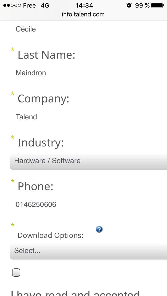
1- it seems that Marketo 2.0 forms are not responsive. I have changed size of labels and fields but they are still too wide

2- I cannot add rectangles on the mobile view

3- I cannot change sizes or position on mobile view

4- visuals that look ok on my PC looks fuzzy on the mobile

5- I cannot change or move the position of the submit button

This is how the desktop view looks like on mobile

This is how the mobile view looks like

Can you help?

Cécile

This post is no longer active and is closed to new replies. Need help? Start a new post to ask your question.
Best answer by Grégoire_Miche2

Bonjour Cécile,

Here, in your approach, you are trying to use a guided LP as you used to with a free-form, but the paradigm has completely changed.

In Guided LP's, you no longer have the possibility to edit the mobile view as you used to with the free-form. You not not have the need either, BTW.

The mobile aspects of the landing page needs to have been factored in the development of the LP. If this is done correctly, your LP will be perfectly responsive, and adapt itself much better to the various types of mobile devices (such as phones is landscape mode or tablets)

-Greg

1 reply

Grégoire_Miche2
Grégoire_Miche2Accepted solution
New Participant
August 29, 2016

Bonjour Cécile,

Here, in your approach, you are trying to use a guided LP as you used to with a free-form, but the paradigm has completely changed.

In Guided LP's, you no longer have the possibility to edit the mobile view as you used to with the free-form. You not not have the need either, BTW.

The mobile aspects of the landing page needs to have been factored in the development of the LP. If this is done correctly, your LP will be perfectly responsive, and adapt itself much better to the various types of mobile devices (such as phones is landscape mode or tablets)

-Greg

Cecile_Maindron
New Participant
August 29, 2016

Grégoire,

I'm not sure I'm following. Are you saying that if my template was correctly implemented, the page would be by default responsive without that I have to do anything? I believe my template is ok as the page is naturally looking good (see screenshot below).
However if I don't set the mobile view, how can I have a different behavior for mobile and desktop user?
Indeed my end goal is that the mobile users get a message that product download is not possible on mobile/tablet and give them specific instructions. This message shouldn't be available for desktop users.

Cécile

Grégoire_Miche2
New Participant
August 29, 2016

Hi Cecile,

To do this, the template needs to have a zone that shows up only on mobile. This is feasible, but needs to have been designed as such by the template designer.

Pls provide the URL of you LP, we will be able to look into it further.

-Greg