Hey Jen,
I've updated the pen here: https://codepen.io/dRoberts/pen/MWpmPad
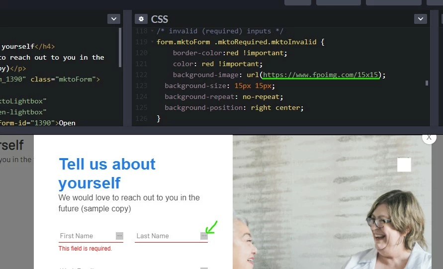
For the (X) icon on the right side of the invalid fields, I'll usually use an image there and load it into the background image of the input. With most elements you can get away with using the ::before and ::after pseudo-elements for this but those won't work for text inputs.
To update this, you'll just want to load a small image (I used 15x15 in the example) into your Design Studio (or on the website depending on where the form page is hosted) and swap out the URL of the placeholder to the URL of the image you just loaded.
 Use the "background-image" property to add validation icons to your fields.Use the "background-image" property to add validation icons to your fields.
For the validation styles, there's a class called ".mktoRequired" that gets put onto any input which is required. In the initial load state of the form, this is the only validation class present. Once you interact with a field, it'll get a new class which you can use to style the validation rules. The new class will either be ".mktoValid" for valid fields or ".mktoInvalid" for invalid fields. In this case, Im using the .mktoInvalid class to style the input to have a red border-bottom and text.
The error message is broken up into a few bits (I've clustered them in the pen) - there's a "container" that positions the text and then a "text box" with the text inside it. These have a bunch of little rules to override, but I'll usually just work thru the inspector looking at the existing styles and then writing new styles with a stronger [better] selector to override them.
For example, I'll use: form.mktoForm { ...}
Instead of: .mktoForm {...} [which is how it is written on forms2.css and also targets <div class="mktoForm">...</div> which doesn't really help]
The Bootstrap adjustments to add a modal to your page would probably need to get added in at the template level, so there might be a bit of dev overhead there to get it setup but from my experience, it's much easier to manage and customize (albeit technical) compared to the built-in lightbox functionality. Most templates these days use Bootstrap in one way or another, so you might already have something like this setup on your template. If you'd like to open a new thread that's more specific to "how to make a modal using Bootstrap" and post some working code for a template there (that uses bootstrap) I'd be happy to help walk thru setting that up a little at at time in the community here -- I think it might be something everyone could benefit from.
Finally, in terms of using the !important flag to override a bunch of styling stuff -- it's definitely not ideal or as good as it "should" be, but given the way Marketo is loading the styles onto the page and the load order of things you add beyond that, it's usually the path of least resistance in the longrun -- albeit a bit clunky and manual (the advantage is that it's a little easier to update/edit once you've got the initial round of styles in there b/c everything is more accessible - there's just a lot to get together).
Let me know if those new styles work out for what you were after or if you've got any questions about how any of that stuff works.
Thanks again,
Dave
Hello @dave_roberts & @sanfordwhiteman
I also was wondering if there is a way to pop a "thank you we will be in touch soon" message in the modal on submit or on the page? If not I will work on an automated email to be sent out on submit.