Hey Sheila,
It looks like the way this is coded it's kind of missing the "fluid" styles that it needs to take the shape of it's container as you resize from mobile to tablet and then desktop.
I've fiddled w/ some CSS in the inspector here which you could add to your form in the "Custom CSS" dialog box on pg2 of the form editor. This should help to override a few of the issues in the theme stylesheet as well as address a few things that come from Marketo that make this not-so-responsive in the first place.
Here's a look at what Im seeing on my end w/ this CSS applied:

Above: desktop view has a total of 4 grid columns: 20px 1fr 20px 1fr

Above: Tablet view also has 4 grid columns: 20px 1fr 20px 1fr
Above: mobile view has 2 grid columns: 20px 1fr
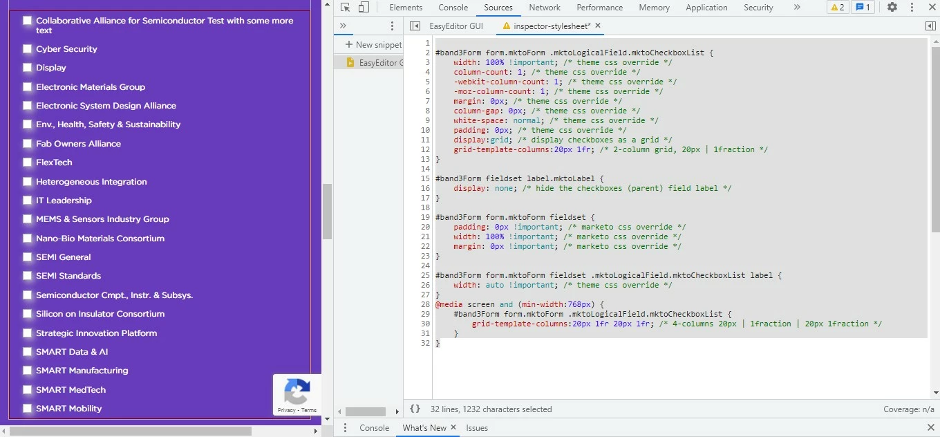
Here's a copy of the CSS I've used in the browser to get these results:
#band3Form form.mktoForm .mktoLogicalField.mktoCheckboxList {
    width: 100% !important; /* theme css override */
    column-count: 1; /* theme css override */
    -webkit-column-count: 1; /* theme css override */
    -moz-column-count: 1; /* theme css override */
    margin: 0px; /* theme css override */
    column-gap: 0px; /* theme css override */
    white-space: normal; /* theme css override */
    padding: 0px; /* theme css override */
    display:grid; /* display checkboxes as a grid */
    grid-template-columns:20px 1fr; /* 2-column grid, 20px | 1fraction */
}

#band3Form fieldset label.mktoLabel {
    display: none; /* hide the checkboxes (parent) field label */
}

#band3Form form.mktoForm fieldset {
    padding: 0px !important; /* marketo css override */
    width: 100% !important; /* marketo css override */
    margin: 0px !important; /* marketo css override */
}

#band3Form form.mktoForm fieldset .mktoLogicalField.mktoCheckboxList label {
    width: auto !important; /* theme css override */
}
@media screen and (min-width:768px) {
    #band3Form form.mktoForm .mktoLogicalField.mktoCheckboxList {
        grid-template-columns:20px 1fr 20px 1fr; /* 4-columns 20px | 1fraction | 20px 1fraction */
    }
}
Let me know if you've got any questions about why what you had in there wasn't working or how any of this is working differently than it was before.
Thanks,
Dave