Positioning of Form Validation Messages | Community
Skip to main content
New Participant
June 30, 2022
Solved

Positioning of Form Validation Messages

  • June 30, 2022
  • 3 replies
  • 6982 views

Hi There!

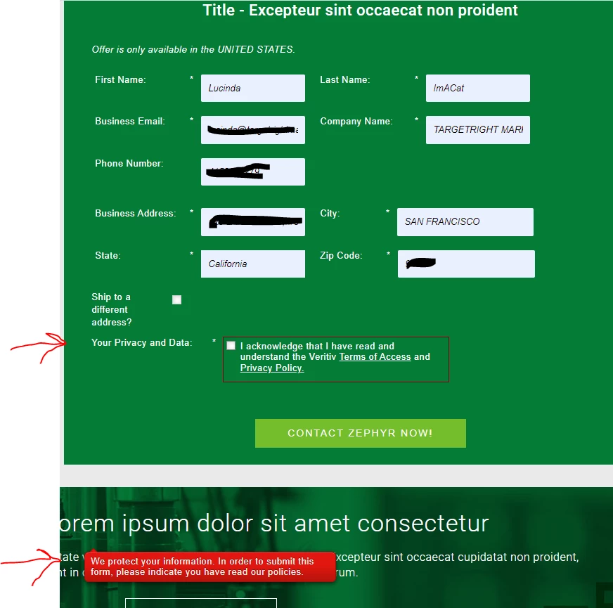
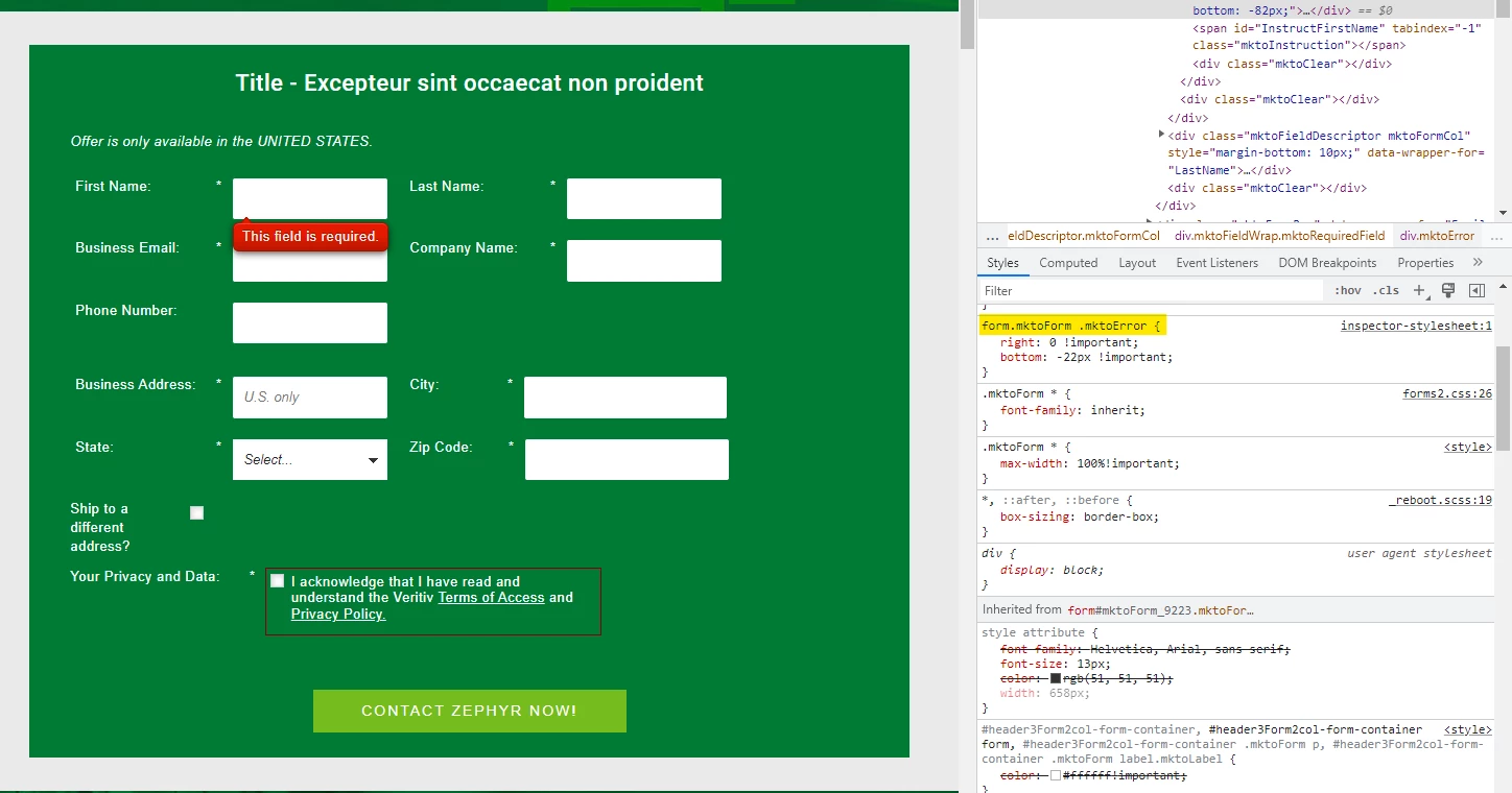
Is there some way to control the positioning of the form validation messages? That is, the message someone sees when she tries to submit a form without filling in a required field? See screenshot below where the validation message is nowhere near the unfilled required field (it's way below the form):


This post is no longer active and is closed to new replies. Need help? Start a new post to ask your question.
Best answer by Dave_Roberts

Here's a look at some CSS I added in the browser console to test out a fix. I think you could add this to your form's Custom CSS and get most of the issue resolved here:


Here's the CSS to add:


form.mktoForm .mktoError { right: 0 !important; bottom: -22px !important; }


This will anchor the error text to the bottom right of each field. The "-22px" value in the "bottom" property is meant to offset the height of the error message. 


Let me know if you need any help finding the Custom CSS input on the form to get this CSS into play or have a look thru the Marketo Docs here for reference: https://experienceleague.adobe.com/docs/marketo/using/product-docs/demand-generation/forms/form-design/edit-the-css-of-a-form-theme.html (note: you'll want to use the Edit Custom CSS option rather than the View Theme CSS panel)

3 replies

Dave_Roberts
Dave_RobertsAccepted solution
New Participant
June 30, 2022

Here's a look at some CSS I added in the browser console to test out a fix. I think you could add this to your form's Custom CSS and get most of the issue resolved here:


Here's the CSS to add:


form.mktoForm .mktoError { right: 0 !important; bottom: -22px !important; }


This will anchor the error text to the bottom right of each field. The "-22px" value in the "bottom" property is meant to offset the height of the error message. 


Let me know if you need any help finding the Custom CSS input on the form to get this CSS into play or have a look thru the Marketo Docs here for reference: https://experienceleague.adobe.com/docs/marketo/using/product-docs/demand-generation/forms/form-design/edit-the-css-of-a-form-theme.html (note: you'll want to use the Edit Custom CSS option rather than the View Theme CSS panel)

DeniseG2Author
New Participant
June 30, 2022

Thank you very much, @dave_roberts! I will give that a try.

Arun_Sharma9
New Participant
June 30, 2022

Hi @deniseg2 ,


It seems some CSS code might be resulting in bad positioning of the error messages.


Please consult your developer to fix the same, mostly the error messages are positioined below the field as "position:absolute" and for that the element should be "position:relative", which means some CSS code added to the fields affecting the position.


Thanks,

Arun Sharma

Arun Sharma
SanfordWhiteman
New Participant
June 30, 2022

Please consult your developer to fix the same, mostly the error messages are positioined below the field as "position:absolute" and for that the element should be "position:relative", which means some CSS code added to the fields affecting the position.

This is incorrect. The CSS position property has not been changed from the form defaults.

Darshil_Shah1
Community Manager
June 30, 2022

By default the validation message is showed next to the fieldt, but a bad CSS could easily cause what you're seeing on the LP. Can you please share the page URL so we can have a look?


DeniseG2Author
New Participant
June 30, 2022

Sure! Here it is (it's a test LP for the purposes of testing the form):


https://go.veritivcorp.com/Denise-Test-LP---Sample-Request---2-col-Shauna-Template.html