Question
Responsive Template - Center Table Issue
Wondering if anyone can assist, on desktop my email template looks great. On mobile, only the top table is centered. What am I missing?
Desktop: Mobile:
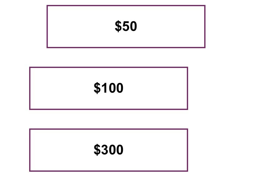
Source code snippet:
@media only screen and (max-width: 479px) {
/*startmobile*/
body {
width: auto !important;
}
.stack-phone {
overflow: visible !important;
float: center !important;
mso-hide: none !important;
display: block !important;
max-height: none !important;
}
table.table600{
width: 320px !important;
float: center !important;
}
table.table1-3{
width: 80% !important;
text-align: center !important;
float:center!important;
}
<table id="three-articles" style="-webkit-text-size-adjust: 100%; -ms-text-size-adjust: 100%; mso-table-lspace: 0pt; mso-table-rspace: 0pt; border-spacing: 0; border-collapse: collapse;" align="center" border="0" cellpadding="0" cellspacing="0" width="100%" class="mktoModule m_three-articles" mktoname="Three-articles">
<tbody>
<tr>
<td style="-webkit-text-size-adjust: 100%;-ms-text-size-adjust: 100%;mso-table-lspace: 0pt;mso-table-rspace: 0pt;word-break: break-word;-webkit-hyphens: none;-moz-hyphens: none;hyphens: none;border-collapse: collapse;background-color:${threeArticlesBackgroundColor};" bgcolor="${threeArticlesBackgroundColor}" valign="top">
<table class="table600" style="-webkit-text-size-adjust: 100%; -ms-text-size-adjust: 100%; mso-table-lspace: 0pt; mso-table-rspace: 0pt; border-spacing: 0; border-collapse: collapse; margin-top: 0; margin-right: auto; margin-bottom: 0; margin-left: auto;" align="center" border="0" cellpadding="0" cellspacing="0" width="600">
<tbody>
<tr>
<td style="-webkit-text-size-adjust: 100%;-ms-text-size-adjust: 100%;mso-table-lspace: 0pt;mso-table-rspace: 0pt;word-break: break-word;-webkit-hyphens: none;-moz-hyphens: none;hyphens: none;border-collapse: collapse;line-height:${threeArticlesSpacer};font-size:${threeArticlesSpacer};" height="${threeArticlesSpacer}"> </td>
</tr>
<tr>
<td style="-webkit-text-size-adjust: 100%; -ms-text-size-adjust: 100%; mso-table-lspace: 0pt; mso-table-rspace: 0pt; word-break: break-word; -webkit-hyphens: none; -moz-hyphens: none; hyphens: none; border-collapse: collapse;">
<center>
<table class="spacer" style="-webkit-text-size-adjust: 100%; -ms-text-size-adjust: 100%; mso-table-lspace: 0pt; mso-table-rspace: 0pt; border-spacing: 0; border-collapse: collapse;" align="left" border="0" cellpadding="0" cellspacing="0" width="30">
<tbody>
<tr>
<td style="-webkit-text-size-adjust: 100%; -ms-text-size-adjust: 100%; mso-table-lspace: 0pt; mso-table-rspace: 0pt; word-break: break-word; -webkit-hyphens: none; -moz-hyphens: none; hyphens: none; border-collapse: collapse;" height="20" width="100%"></td>
</tr>
</tbody>
</table>
<table class="table1-3" style="-webkit-text-size-adjust: 100%; -ms-text-size-adjust: 100%; mso-table-lspace: 0pt; mso-table-rspace: 0pt; border-spacing: 0; border-collapse: collapse;" align="left" border="0" cellpadding="0" cellspacing="0" width="176">
<tbody>
<tr>
<td style="-webkit-text-size-adjust: 100%; -ms-text-size-adjust: 100%; mso-table-lspace: 0pt; mso-table-rspace: 0pt; word-break: break-word; -webkit-hyphens: none; -moz-hyphens: none; hyphens: none; border-collapse: collapse;">
<table class="contents" style="-webkit-text-size-adjust: 100%; -ms-text-size-adjust: 100%; mso-table-lspace: 0pt; mso-table-rspace: 0pt; border-spacing: 0; border-collapse: collapse;" align="center" border="0" cellpadding="0" cellspacing="0" width="100%">
<tbody>
<tr>
<td style="-webkit-text-size-adjust: 100%; -ms-text-size-adjust: 100%; mso-table-lspace: 0pt; mso-table-rspace: 0pt; word-break: break-word; -webkit-hyphens: none; -moz-hyphens: none; hyphens: none; border-collapse: collapse;">
<table style="-webkit-text-size-adjust: 100%; -ms-text-size-adjust: 100%; mso-table-lspace: 0pt; mso-table-rspace: 0pt; border-spacing: 0; border-collapse: collapse;" align="center" border="0" cellpadding="0" cellspacing="0" width="100%">
<tbody>
<tr>
<td class="primary-font name" style="hyphens: none;-webkit-text-size-adjust: 100%;mso-table-lspace: 0pt;mso-table-rspace: 0pt;word-break: break-word;-webkit-hyphens: none;-moz-hyphens: none;-ms-text-size-adjust: 100%;font-family:Arial, Helvetica, sans-serif;text-align: center;font-size: 22px;font-weight: bold;color: ${emailBodyColor};border:2px; border-style:solid; border-color:${emailBorderColor};padding-top: 20px;padding-right: 20px;padding-bottom: 20px;padding-left: 20px;">
<div class="mktoText" mktoname="Left Title" id="title3">
$50
</div> </td>
</tr>
</tbody>
</table> </td>
</tr>
</tbody>
</table> </td>
</tr>
<tr class="stack-phone" style="padding-bottom: 0; max-height: 0; overflow: hidden; float: center; display: none; padding-top: 0; padding-right: 0; mso-hide: all; padding-left: 0; margin-top: 0; margin-right: 0; margin-bottom: 0; margin-left: 0; font-size: 30px; line-height: 30px;">
<td style="mso-line-height-rule: exactly; word-break: break-word; -webkit-hyphens: none; -moz-hyphens: none; hyphens: none; border-collapse: collapse; text-align: center;"> </td>
</tr>
</tbody>
</table>
<table class="spacer" style="-webkit-text-size-adjust: 100%; -ms-text-size-adjust: 100%; mso-table-lspace: 0pt; mso-table-rspace: 0pt; border-spacing: 0; border-collapse: collapse;" align="left" border="0" cellpadding="0" cellspacing="0" width="10">
<tbody>
<tr>
<td style="-webkit-text-size-adjust: 100%; -ms-text-size-adjust: 100%; mso-table-lspace: 0pt; mso-table-rspace: 0pt; word-break: break-word; -webkit-hyphens: none; -moz-hyphens: none; hyphens: none; border-collapse: collapse;" height="20" width="100%"></td>
</tr>
</tbody>
</table>
<table class="table1-3" style="-webkit-text-size-adjust: 100%; -ms-text-size-adjust: 100%; mso-table-lspace: 0pt; mso-table-rspace: 0pt; border-spacing: 0; border-collapse: collapse;" align="left" border="0" cellpadding="0" cellspacing="0" width="176">
<tbody>
<tr>
<td style="-webkit-text-size-adjust: 100%; -ms-text-size-adjust: 100%; mso-table-lspace: 0pt; mso-table-rspace: 0pt; word-break: break-word; -webkit-hyphens: none; -moz-hyphens: none; hyphens: none; border-collapse: collapse;">
<table class="contents" style="-webkit-text-size-adjust: 100%; -ms-text-size-adjust: 100%; mso-table-lspace: 0pt; mso-table-rspace: 0pt; border-spacing: 0; border-collapse: collapse;" align="center" border="0" cellpadding="0" cellspacing="0" width="100%">
<tbody>
<tr>
<td style="-webkit-text-size-adjust: 100%; -ms-text-size-adjust: 100%; mso-table-lspace: 0pt; mso-table-rspace: 0pt; word-break: break-word; -webkit-hyphens: none; -moz-hyphens: none; hyphens: none; border-collapse: collapse;">
<table style="-webkit-text-size-adjust: 100%; -ms-text-size-adjust: 100%; mso-table-lspace: 0pt; mso-table-rspace: 0pt; border-spacing: 0; border-collapse: collapse;" align="center" border="0" cellpadding="0" cellspacing="0" width="100%">
<tbody>
<tr>
<td class="primary-font name" style="hyphens: none;-webkit-text-size-adjust: 100%;mso-table-lspace: 0pt;mso-table-rspace: 0pt;word-break: break-word;-webkit-hyphens: none;-moz-hyphens: none;-ms-text-size-adjust: 100%;font-family:Arial, Helvetica, sans-serif;text-align: center;font-size: 22px;font-weight: bold;color: ${emailBodyColor};border:2px; border-style:solid; border-color:${emailBorderColor};padding-top: 20px;padding-right: 20px;padding-bottom: 20px;padding-left: 20px;">
<div class="mktoText" mktoname="Center Title" id="title4">
$100
</div> </td>
</tr>
</tbody>
</table> </td>
</tr>
</tbody>
</table> </td>
</tr>
<tr class="stack-phone" style="padding-bottom: 0; max-height: 0; overflow: hidden; float: center; display: none; padding-top: 0; padding-right: 0; mso-hide: all; padding-left: 0; margin-top: 0; margin-right: 0; margin-bottom: 0; margin-left: 0; font-size: 30px; line-height: 30px;">
<td style="mso-line-height-rule: exactly; word-break: break-word; -webkit-hyphens: none; -moz-hyphens: none; hyphens: none; border-collapse: collapse; text-align: center;"> </td>
</tr>
</tbody>
</table>
<table class="spacer" style="-webkit-text-size-adjust: 100%; -ms-text-size-adjust: 100%; mso-table-lspace: 0pt; mso-table-rspace: 0pt; border-spacing: 0; border-collapse: collapse;" align="left" border="0" cellpadding="0" cellspacing="0" width="10">
<tbody>
<tr>
<td style="-webkit-text-size-adjust: 100%; -ms-text-size-adjust: 100%; mso-table-lspace: 0pt; mso-table-rspace: 0pt; word-break: break-word; -webkit-hyphens: none; -moz-hyphens: none; hyphens: none; border-collapse: collapse;" height="20" width="100%"></td>
</tr>
</tbody>
</table>
<table class="table1-3" style="-webkit-text-size-adjust: 100%; -ms-text-size-adjust: 100%; mso-table-lspace: 0pt; mso-table-rspace: 0pt; border-spacing: 0; border-collapse: collapse;" align="left" border="0" cellpadding="0" cellspacing="0" width="176">
<tbody>
<tr>
<td style="-webkit-text-size-adjust: 100%; -ms-text-size-adjust: 100%; mso-table-lspace: 0pt; mso-table-rspace: 0pt; word-break: break-word; -webkit-hyphens: none; -moz-hyphens: none; hyphens: none; border-collapse: collapse;">
<table class="contents" style="-webkit-text-size-adjust: 100%; -ms-text-size-adjust: 100%; mso-table-lspace: 0pt; mso-table-rspace: 0pt; border-spacing: 0; border-collapse: collapse;" align="center" border="0" cellpadding="0" cellspacing="0" width="100%">
<tbody>
<tr>
<td style="-webkit-text-size-adjust: 100%; -ms-text-size-adjust: 100%; mso-table-lspace: 0pt; mso-table-rspace: 0pt; word-break: break-word; -webkit-hyphens: none; -moz-hyphens: none; hyphens: none; border-collapse: collapse;">
<table style="-webkit-text-size-adjust: 100%; -ms-text-size-adjust: 100%; mso-table-lspace: 0pt; mso-table-rspace: 0pt; border-spacing: 0; border-collapse: collapse;" align="center" border="0" cellpadding="0" cellspacing="0" width="100%">
<tbody>
<tr>
<td class="primary-font name" style="hyphens: none;-webkit-text-size-adjust: 100%;mso-table-lspace: 0pt;mso-table-rspace: 0pt;word-break: break-word;-webkit-hyphens: none;-moz-hyphens: none;-ms-text-size-adjust: 100%;font-family:Arial, Helvetica, sans-serif;text-align: center;font-size: 22px;font-weight: bold;color: ${emailBodyColor};border:2px; border-style:solid; border-color:${emailBorderColor};padding-top: 20px;padding-right: 20px;padding-bottom: 20px;padding-left: 20px;">
<div class="mktoText" mktoname="Right Title" id="title5">
$300
</div> </td>
</tr>
<tr>
<td style="-moz-border-radius: 4px; -webkit-border-radius: 4px; border-radius: 4px; -webkit-text-size-adjust: 100%;-ms-text-size-adjust: 100%;mso-table-lspace: 0pt;mso-table-rspace: 0pt;word-break: break-word;-webkit-hyphens: none;-moz-hyphens: none;hyphens: none;border-collapse: collapse;line-height:${threeArticlesSpacer10};font-size:${threeArticlesSpacer10};" height="${threeArticlesSpacer10}"> </td>
</tr>
</tbody>
</table> </td>
</tr>
</tbody>
</table> </td>
</tr>
</tbody>
</table>
</center> </td>
</tr>
</tbody>
</table> </td>
</tr>
</tbody>
</table>